It is 5:37pm on Wednesday, Apr. 15. I may add to the “As a writer/communicator – just for fun” component of this post after looking over the typography readings again.
Reflection Piece – I’d like you to connect now all that you’ve learned in this class to your own work, be it as a teacher, as a scholar, as a professional writer/technical communicator. How do these new ways of thinking about the visual influence:
- How you see information being understood by your audience?
- How you approach the invention portion of your projects?
- The relationships between the visual and other modes (linguistic, auditory, kinetic, etc.)?
As a scholar
My current goal is to complete composing my thesis by the end of the summer; I hope to use my Fall 2015 thesis hours for revisions, defending, etc. My final project for this course will function as a brief pilot version of my thesis, more or less.
Barthes‘ “The Rhetoric of the Image” (1977) discusses how text and images in the same space function together. He uses an advertisement to discuss this reciprocal relationship. Anchoring text “anchors” the image in a specific way, while relaying text functions in tandem with the image in a reciprocal relationship. The linguistic components of electronically-mediated messages tend to relay more often than they anchor.
Outside of the course readings, I’ve come across research on people’s use of emoticons as punctuation. Typographic components like colons (:) and semicolons (;) make crude images that convey emotions based on their resemblances to facial expressions. However, we still understand emoticons in linguistic terms; punctuation is still linguistic. Barthes’ explanation of how text and images function together will help me connect this existing research on emoticons as punctuation to the use of smileys and emojis as punctuation.
Somewhat similarly, Hocks and Wysocki, in different works, take concepts similar to those of Barthes into the digital realm; they propose that text and images in digital environments boast a reciprocal relationship more obviously than text and images in nondigital environments. (Hocks more specifically proposes that different sensory elements (audio) function alongside text, images, etc.) Their work goes to show that we understand the visual in textual terms, and text is visual.
In “The Pictorial Turn”, Mitchell explains that our desire to understand the function(s) of photos should not limit our study to one specific method. In other words, we should look at photos as their own texts. While smileys and emojis are not photos, per se, we understand them as visual in nature. This is why they have different functions that are dependent on contexts and placements.
Kelly claims in their work that those addressed are cultural and social agents in communication. In other words, the backgrounds, worldview, and thoughts of those addressed in communication influence how said communication is interpreted; meaning isn’t fixed. Similarly, Atzmon points out that “the designer’s intention is not absolutely determinative” (xv). These works pave the way for people to view artifacts through different lenses that in themselves work toward making meaning. Thus, my work can view the use of Gay Cat on ATRL through the lens of queer theory and queer rhetoric to see how the smiley “queers” otherwise “nonqueer” texts.
As a writer/communicator – just for fun
At the moment, I plan to graduate with my M.A. at the end of the calendar year. After that, I may pursue a Ph.D., but my current goal is to pursue a career in writing after graduation. More specifically, I hope to monetize my blog about the Oscars, though I realize I will likely have more practical employment (professional/technical communication in the workplace) shortly after graduation. I will focus on my desired goal of Oscar blogging in this portion of the reflection piece.
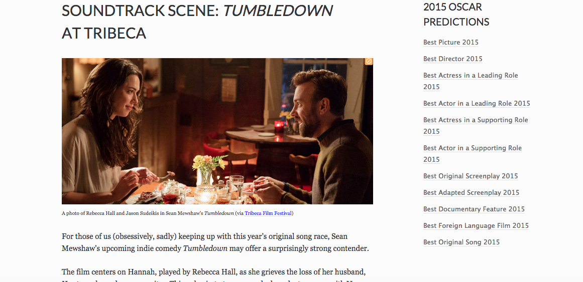
A screenshot of a recent blog post… in which I could have made a better decision in regard to visual rhetoric.
The blog post pictured above describes how original music factors into an upcoming film called Tumbledown. The title of the post functions as anchoring and relaying text. The image I incorporated into the blog post comes from the film’s official page on Tribeca Film Festival, where the film will premiere on Saturday.
Billboard originally reported the story; the article there used a still from Tumbledown in which Hall wears headphones. While this does not directly depict the singer-songwriter who composed original music for Tumbledown, the depicted act of Hall listening to music directly ties back to (relays) the linguistic content of the story.
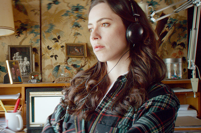
The still from the Billboard article
However, I wanted to diversify sources, hence my use of a picture from Tribeca Film Festival, not the Billboard photo. The (denoted) image showcases actors Rebecca Hall and Jason Sudeikis in what seems to be a pleasant dinner conversation. The still is directly related to the film, as it is approved by those in charge of producing the film, getting it sold, etc. However, the photo’s relation to the linguistic content of my post is solely tangential – it relates to a seemingly different component of the film.
The myth of neutrality is still very much alive, unfortunately, as I see something even worse upon looking at the context (connoted image). I used a generic, arguably heterosexist, studio-approved image on a site that functions as marketing for the film (Tumbledown currently lacks stateside distribution) in a blog post about how music functions in a movie about a woman’s journey. More broadly, a context-free image of a cis woman and a cis man eating dinner together is as dull as, well…

Groundbreaking! (via Slate)
Additionally, looking at Kelly‘s work and Atzmon‘s proposal that “the designer’s intention is not absolutely determinative” (xv), I can see that my own (feminist and queer) lenses have shaped my interpretation of the image. The image comes from a film that may or may not reinforce heterosexism – the jury’s still out on that one. But the image, removed from context, can be read as heterosexist through feminist and queer lenses. I doubt that the “designer” (some lackey in the production company’s PR department?) picked the image to reinforce patriarchy/heterosexism/the practice of using boring photo stills to promote movies. However, my lenses offer an interpretation of the image that likely differs from that of the unknown designer.
While it was my decision to use the image in my work in a problematic way (though I failed to recognize it at the time), I see such laziness in choosing photos on other awards blogs, too. I hope that future rhetorical decisions I make can work against – and possibly toward deconstructing – the myth of neutrality in photos used on awards blogs.